Thursday, January 27, 2011

Book cover

For some reason when I uploaded my book covers, the pink just got obnoxious, these are better uploads with the pink the way its supposed to be. 


Front Cover
Took away the flap, made the "T" more readable. It was a cool idea to make the tail cradle the "tis" but it just didn't work out, it stretched the tail to much. Changed the border to pink instead of yellow. 

Back Cover
 Changed the border to pink, got rid of the rat.


Made the tree more recognizable as a tree...


First Draft front

I don't know if I like the tree trunk wear it is, I'm thinking about moving it to the middle of the flap and maybe throwing in some basic lines to look like tree bark. Right now I'm not sure if it comes across as a tree. 


First draft back

Thursday, January 20, 2011

Book layout

Continuing with the gritty old style, dragons and maps theme, I thought an old fashioned journal would be good for a book layout. Great thing about this is if the book gets dirty who's gonna notice?

The book layout is 8x10 portrait. If I have process work, the art and process will fill two pages next to each other. The old piece of paper is for captions, if I need more room to either display art or write stuff, I can remove the drawing.

Business card concept

EDIT: Changed the text so it's closer together.


EDIT: After in class critique I came up with this. I used parchment font which was more fitting, made the logo larger and changed the overall orientation to be more square and stackable.


Since my logo is a dragon, though a torn piece of an old map would be fitting for a business card. 


Tuesday, January 18, 2011

Brand color palate (unfinalized)


Developing a color palate for my brand based on my logo design. Will add colors as needed, these swatches will make up the color scheme for my business card, book layout, website and everything else. 


Monday, January 17, 2011

Making my logo part 4

 Since the whole idea of my logo is that it's a purple dragon, I can't really change the color of the lines. I'm trying different background combination's and shades of purple to see which background variations look best.

 white


 old paper


 mint green 


 light purple on black


standard purple on black with white colored in

Making my logo part 3


I got a comment that the dragon looks like it's floating in space and maybe I should ground it on something. I'm playing with the idea of horizontal lines. Not only do they give the dragon something to sit on, but they make a great place for text if I need it. Also the lines remind me of reference lines used in a character turn around.


Added two more reference lines in the middle to help with the character turn around look. Now that I think about it, it kind of looks distracting or maybe like a music bar and less like a character turn around.


Tried a stylized tree branch instead of the lines.

Sunday, January 16, 2011

Making my logo part 2


I like this version of the wing better, originally the circle for the head was just sketch to form the head, I was going to erase it but now I like it since it matches the body. I've decided that I don't like the pink, I'm going to try messing around with it to see if I can make it work in a better way, if not then I'll go back to all purple.


Messing with the pink and purple coloring, I don't like the whole spots colored in and I don't think there's enough contrast.


Now the colors of the wings and the tail follow the lines like the rest of the body.


Tried with a darker purple, I like this one more, it has better contrast against a white background, however if I do go with this version, I know I wont be able to use black as a background.


Some refining, used the pen tool, cleaned up the lines so they aren't so choppy.

Making my logo part 1


I'm using Lester as the focus for my logo, but I don't want to use the character design himself, I want a simplified version. Something that is recognizable as a purple dragon, but not with so much detail.

I like the pose he has in this picture, with the tail curled forward, so I'm thinking about basing my simplified version off of that.
  

This pose is more seeing him from the back rather then the side like in the artwork, but I like how the tail starts inside the circle of the body.
Since Lester is such a fat dragon, I decided to use a circle for the whole shape of the body. I used a simple curved line to show the tail and neck. I don't really like the wing, the lines aren't clean enough and I want to include some pink and see what it looks like in other color schemes.

Saturday, January 15, 2011

Print Portfolio Presentation logo- ideas- week 1

Trying to come up with an idea for a logo, I asked my friends and family "What's the first thing that comes to your mind when you think of me." the response I got was either "determination" or "dragons" since I'm not really sure how to show determination in a logo, I decided to go with dragons.

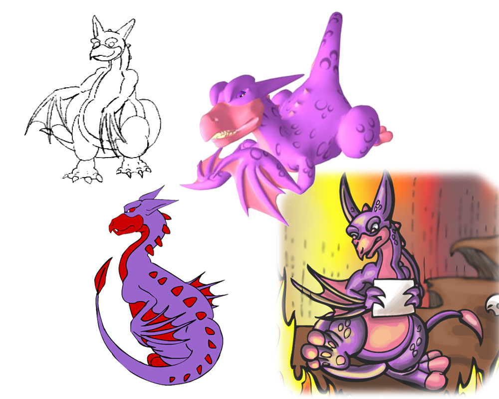
I love dragons, but since so many people love dragons as much as I do, I've tried not to include them in my portfolio. One dragon in particular slipped through the cracks.

His name is Lester; I first invented him in digital animation for a flash project. He's a great character to animate because he's easy to draw and easy to move. Also for that reason, he's wormed his way into almost every other form of animation I've tried since (Including traditional 2D and 3D) as well as comics and digital illustration. 


After that I thought about what separates me from others. I'm good at a lot of things, but not really GREAT at anything, and I don't want to say I'm the best at something like modeling or texturing because I'm sure there is always someone better.

One thing I did notice I tend to do is appropriate. Take boring things and try to make them interesting. Example, cinematic tech 2 isn't an art class, but I did a digital illustration for the final. The final requirement was that we do something influenced by a movie. I used a scene directly from the movie "Yojimbo" and made them all into wolf samurai, so it was kind of like a lone wolf fighting the pack thing.


It's just coincidence that Lester happens to be a purple dragon. Purple is as strange a color for a dragon as it is for a cow.
A purple cow means something that is out of the ordinary.
A dragon is a creature everybody recognizes.

So I was thinking a purple dragon could symbolize appropriation. Taking something everybody recognizes and making it out of the ordinary.